UX is not UI, but UI is definitely UX
Premier Dev Consultant Madeline Schenck explains how UX and UI are commonly interchanged in conversation, but have very different implications.
When people hear that I specialize in User Experience, they often assume I focus on frond-end design.
When I first joined the Premier team here at Microsoft, a lot of the work I initially did for our customers was just that – advisory front-end design work. After many discussions about how I can provide value to our customers, I started to realize that even though words likes User Experience and User Centered Design are starting to be thrown out more and more in development, very few people have a full grasp of what exactly User Experience is.
Typically the term UX is used interchangeably with UI or referred to as UI/UX. UI (User Interface) refers to the visuals that the end user sees and interacts with when they open a solution (app, website, dashboard, etc). More often than not when people ask me to help with their product’s UX, they really mean that they want the UI to look pretty. Don’t get me wrong, UI and visual design are a huge part of a product’s UX, but a pretty color scheme and cool animations won’t help your user much if your navigation menu is poorly organized.
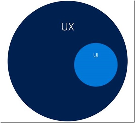
Instead of thinking of UI and UX as interchangeable terms, I’ve found it’s easiest to compare the two in a sort of Venn Diagram, except that the circle for UI is completely within the circle for UX.

As I mentioned earlier, the UI of your application concerns the visuals that your user sees and interacts with. It’s the color scheme, the fonts, the size of different elements on the page, etc. It’s a hugely important component to the UX of your solution, but it’s not the only part. Sometimes it’s not even the biggest part.
When developing a solution, you also have to consider things like how your navigation menu is organized. How your users switch from your phone app to your website. The different usage patterns between Windows and MacOS users. The age range of your target audience. The frequency that your target audience uses certain features or pathways over others. The list goes on and on. Truly the UX encompasses everything that could affect your users overall experience with your solution, including the UI.
If we dive a bit deeper into where certain deliverables or techniques fall, the UX or UI breakdown starts to look more like this:

Things like typography choices, color schemes, and visual design of a page typically fall into the little UI bubble within your product’s UX. I’ve worked with a lot of customers who treat these things only as UI decisions and don’t consider gathering user feedback on current solutions or conducting any user research. In my experience, this is a disservice to your users in the short term and your development team in the long run. All UI decisions should incorporate preferences or knowledge about your users. Using this sort of information in the beginning of a development project can save your team costly rework later on.
For example: You’re a designer who needs to decide how to color a new application. You’re limited by your company’s brand, but are still trying to decide where to use specific colors to optimize the look and feel. Chances are you’re the only designer on the project, so you often have to make all of the decisions yourself. You initially settle on a medium blue background with thin, white text. Because you didn’t have any user research to work with or didn’t take more time to get some, you ultimately created an interface solely based on looks. By doing that you missed out on the most important aspect of this design—the user. If you took a bit of time to talk to your users or review feedback they might’ve provided earlier, you’d find your end users tend to be over the age of 50 and typically have poorer vision than a user base in their early 20s. Because of that, it makes sense to design a layout with high contrast color scheme and larger text sizes. Now with that background information on your users, you might choose to go instead with a dark blue background with 16px bold white font for the navigation menu of your app. You’ve also now saved the development team (and yourself) time because the users won’t complain about legibility, and you and the developers won’t have to go back and fix the color scheme.
Things like user research, feedback from existing solutions, and personas are all user experience related items that are not specific to creating the UI for your project, but that doesn’t mean that they’re any less important. UI decisions should never happen in a bubble. Engaging your users and incorporating their feedback into every stage of your design and development process can give you and your team valuable insight. Understanding that UX isn’t just limited to your solution’s UI is the first step in recognizing how investing in UX can save you time and effort in all of your technological solutions.
0 Comments on "UX is not UI, but UI is definitely UX"